#RNation National Anthem Idea

Over the last few years (at least), fan bases have taken it upon themselves to ‘personalize’ the singing of the national anthem in their buildings. A couple of my favourites are the Winnipeg Jets (“True North!”) and the Dallas Stars (“Stars!”). Have a look/listen:

Winnipeg: http://youtu.be/zFvOzjq3QhY

Dallas: http://youtu.be/lQ_y3Xo-XYE

With these in mind, here’s an idea for how Ottawa Redblacks fans could put our own unique spin on the singing of the national anthem:

“O Canada!
R! home and native land!
True patriot love in all thy sons command.

With glowing hearts we see thee rise,
The True North strong and free!

From far and wide,
O Canada, we stand on guard for thee.

God keep R! land glorious and free!
O Canada, we stand on guard for thee.

O Canada, we stand on guard for thee.”

What do you think, #RNation? Too much? 🙂

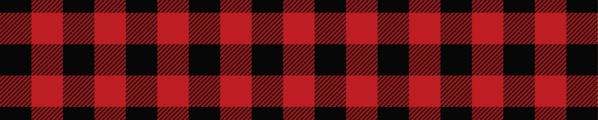
Meet ____________, the newest addition to Ottawa’s mascot scene

By: Santino Filoso

This past Monday, the Ottawa Redblacks unveiled their new mascot during the 67’s Family Day matinee. In a very fitting move, the team chose to keep with the plaid theme and unveiled this handsome fella:

This as of yet unnamed mascot keeps with the theme that the Redblacks organization has chosen to embrace with their brand, logo and history.
1) It pays homage to Ottawa’s lumber history by invoking memories of folk heroes such as Big Joe Mufferaw
2) Lumberjacks are about as Canadian you can get so it’s completely appropriate for the Nation’s Capital’s team
3) He has a jawline that can cut trees, freeing up his axe to chop through opposing teams.

Of course it wouldn’t be Redblacks news without a heavy dose of criticism; first the name was mocked for being too outlandish yet now the mascot is dumped on for being an unoriginal stereotype. Here’s what the naysayers are forgetting; mascots are for kids, and judging by the stream of beaming children’s pictures on Twitter, our lumberjack is a hit!

The Redblacks have given their fans the floor by letting them send suggestions for the name and Twitter wasted no time in responding. Here’s a taste:

The Good
Rough Rider, Big Joe, Tim Bur, Rideau Rooter, Bytown Bob, Big Joe Mufferaw

The Bad
Red Black Jack, Woody, Chopper, Brawny

The Ugly
Axelrod, Arbee, Louis Poutine, Sir Choppington

Personally, I really like idea of naming the mascot Big Joe Mufferaw but what do you think? Send your ideas here.

@RedBlackGade

More Redblacks jersey concepts & a concept update

Finally let the cat out of the bag on Twitter about this blog. Thanks to all of you that have checked it out in the last couple of days. We’ll see what this can grow into in the coming months.

On to the topic at hand – and one of my favourite topics at that – jersey concepts. We’re always on the lookout for these and came across a couple more. FYI – couldn’t locate the sources of today’s new concepts. If you can, please share with us.

Have a look:

20140217-010004.jpg

20140217-010022.jpg

Well, I think it’s safe to assume someone was having a bit of fun with the plaid concept. Don’t think that could ever seriously work. Perhaps as a one-time-use promotional jersey. The black-jersey-red-pant concept, however, has some interesting elements, including the much more subtle plaid trim and the fact that white is almost completely left out of the colour palette. Redblacks logo on the front is definitely a wee bit big.

Here’s another concept that’s a little out there:

20140217-010546.jpg

Just a little too much going on with this set. That said, the more contemporary jersey template they’re built on is interesting. Maybe with fewer colours in the mix this could turn into something that works.

The last one for today is an update on a great concept by Dan Ruggiero originally featured in this post. Have a look at these:

20140217-011047.jpg

20140217-011059.jpg

20140217-011110.jpg

Pretty slick stuff. As Dan mentioned in his Tweet on Sunday, jerseys/pants/socks could be very easily interchanged with these sets. I do not doubt it. And that red helmet could really work, couldn’t it? I personally wouldn’t want it as the primary helmet, for historical reasons, but definitely a solid alternate.

Looking at some of Ottawa’s uniforms of the past, the all-red set is a call-back to Ottawa Rough Rider uniforms worn in the 1940s, while the all-white set with red accents is along the lines of what was worn in the early 1960s, as below:

20140217-120001.jpg

Not sure that was exactly the intention, but a happy coincidence for sure.

Again, if you’ve come across (or designed, for that matter) any Redblacks jersey concepts, please let us know about them and we’ll be sure to feature in a future post.

#RNation

20140215-151213.jpg

In spite of what people think about ‘Redblacks’ as the name for our new CFL team (I’m personally not a huge fan, although it has definitely grown on me), the marketing folks at Ottawa Sports & Entertainment Group have done a nice job in creating a meaningful moniker for the fan base – R Nation (check out #RNation discussion right now on Twitter)

At first glance, it seems too simple, even lazy. (“Yeah, yeah, Redblacks starts with an ‘R’ and you added ‘Nation’. Great…”) But here’s why I think it might just be a little bit of genius:

A link to the past
There is nothing more emblematic of the proud football history in Ottawa than the white ‘R’ that has adorned the helmets of those great Rough Rider teams of the 1960s & 70s, teams that created some of the greatest sporting memories in this city’s history. Not to mention hats & other gear worn by legendary coaches like Frank Clair (below) and Jack Gotta.

20140215-142010.jpg

Yes, we’re not the Rough Riders (two words) anymore. And there are a lot of good reasons, frankly, to let that name die. The last couple decades of that franchise’s existence are better forgotten (perhaps it’s no coincidence that the ‘R’ logo was missing in those last few agonizing years of the Rough Riders existence, not to mention the entire 4 years the Renegades were around). But we’re still Ottawa football and the ‘R’ logo is held in very high regard by those who remember the heydays. This is tradition worth maintaining and honouring.

The ‘R’ is also a great way to create a linkage between the players and the fans of the Rough Riders, Renegades and now the Redblacks.

The Nation’s Capital
Besides team history, R Nation is a clever double-entendre, i.e. “Our Nation”. A great slogan for the team in the capital of Canada’s only true professional sports league. Fits very nicely with the CFL’s “This is our league” slogan, too. And isn’t it a pretty neat thing to be able to say “Welcome to R Nation” to CFL rookies from the US? Oozing with pride & nationalism.

In just a few short weeks, the #RNation name has really been embraced by the budding Redblacks fan base. I must admit it is also part of the inspiration for the name of this humble blog. Again, credit to OSEG and the Redblacks for recognizing these linkages to the past and how important it is to incorporate this rich history into the identity of the new team. They get it.

The R Nation nickname has also been met with some surprising bitterness/anger from Saskatchewan fans who believe it to be too similar to their #ridernation fan base nickname. A little misguided, however, as this is not about them. The Rider name is their’s. But the ‘R’ belongs to Ottawa.

Redblacks jersey numbers?

On the day of the Redblacks Expansion Draft, an astute CFL fan noted that the Redblacks official site was using this number template on its player pages:

20140209-155343.jpg

An interesting find. Definitely matches the cut-out style on the Redblacks R logo, as below:

20140209-155910.jpg

If this is indeed the number template they’re going with, it certainly points to a non-traditional jersey style. Not necessarily a bad thing. Certainly an ambitious choice. High risk, high reward, I suppose.

Interesting to note that the team has since removed the player number references from all player pages. Simply because numbers haven’t officially been assigned to players yet? Or cleaning up an unintended mini-leak? Pure speculation at this point. Pretty enjoyable speculation, actually 🙂

#RNation

Ottawa Redblacks jersey concepts

Probably the most anticipated – and hotly contested – elements of any new franchise launch are the team name, logos and uniforms. Ottawa is certainly no exception. The Redblacks name was met with a mix of confusion (“what’s a Redblack?”), acceptance (“I’m just happy to have football back in Ottawa!”) and (if Twitter is a true gauge of the fan base) intense hatred. The logo, on the other hand, has been pretty warmly accepted.

And now, we wait for the uniforms.

According to Ottawa Sports & Entertainment Group and Ottawa Redblacks President Jeff Hunt, uniforms will be released in April 2014. The original plan was to have jerseys out before Christmas, but looks like Reebok needed more time than anticipated, as they are also releasing all new alternate jerseys for every team. That puts us still a couple of agonizing months away. What is an Ottawa CFL football fan to do?

Answer: concept art!

Here are a few of the concepts I’ve come across over the last few months. The first is from Nelson Hackewich:

20140208-233149.jpg

20140208-233203.jpg

20140208-233209.jpg

20140208-233217.jpg

In my opinion, Nelson absolutely knocked it out of the park with this concept. The simple, classic striping on the arms, the Russ Jackson-era red numbers on the white uniforms, the Redblacks ‘R’ alone on a black helmet. Perfection. If OSEG land anywhere close to this, I believe they will have one happy fan base.

This next collection is from Nevill Carney:

20140208-234829.jpg

Another great collection with a classic look. This one more 70s/80s-era Riders. I think Nevill is bang-on in expecting a black home & white away, as well as a red alternate jersey right out of the chute. As for an official retro jersey, my guess is the Redblacks wait a year before wearing them, as they will likely want to focus on building their own brand. Also, releasing four different jerseys in the inaugural season seems slightly excessive.

Next is this trio by Dan Ruggiero:

20140209-000351.jpg

20140209-000359.jpg

20140209-000408.jpg

What’s not to like about these? Nothing loud or crazy. Just some very well executed uniforms. Simple, clean design, yet still modern. The red helmets look quite good (I liked them more than I thought I would, actually), but my guess is the Redblacks stick with tradition and a black helmet – in year one, anyway.

Hopefully this whets your appetite for a little while, #RNation. Kudos to these three talented gentlemen on some great work. I’ll be on the lookout for other concepts in the days ahead as excitement builds towards the official release.

Welcome to ‘Defend the R’

20140208-230249.jpg

Thanks for stumbling upon Defend the R, a blog dedicated to coverage of Ottawa’s CFL franchises past and present. I plan to share thoughts & ideas about the Redblacks, as time ticks down to kick-off in their inaugural season, as well as take a look back at franchises from the past – the Ottawa Rough Riders and the Ottawa Renegades. (SIDE NOTE: How perfect is this WordPress theme for an Ottawa CFL blog!!)

I will do my best to keep this blog up-to-date. If it happens to get a little stale, you can be sure there will be some action on Twitter at @OTTRoughRiders.

Looking forward to interacting with you in this format, #RNation.

20140209-154443.jpg