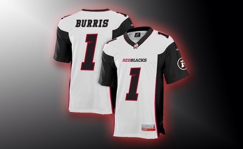
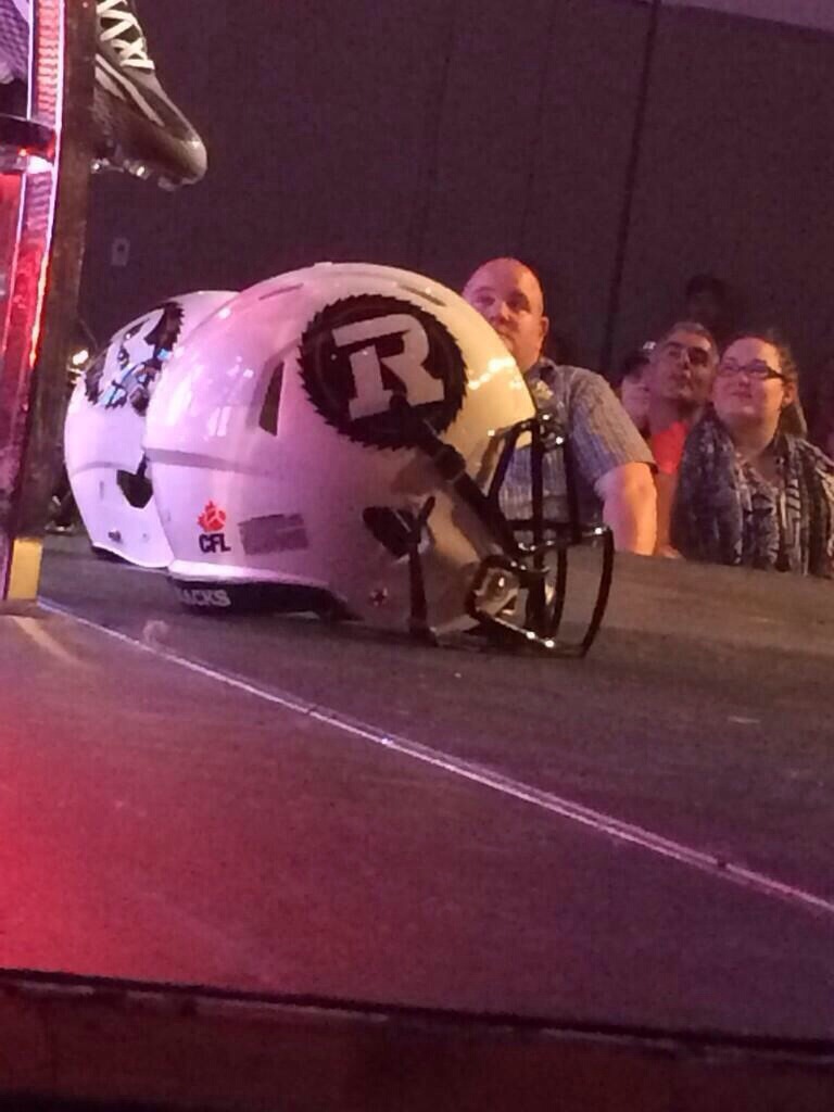
For an expansion franchise, the uniform unveiling is pretty much the last major milestone before the games begin. And the Ottawa Redblacks did their unveiling in style, in front of 1,200 season ticket holders at the Ottawa Conference And Event Centre on Tuesday night. We weren’t able to be there in person, but #RNation did a great job bringing us there. Thanks to everyone for the providing the photos below. Hope to eventually source them all properly.
Without further ado, let’s take a closer look at each uniform:
HOME UNIFORM
ROAD UNIFORM
That was fun!
My thoughts:
– Very cool that we have different home & away helmets. The traditional black looks great, but I love the white!
– Jersey number font is the same style as we saw at mini-camp, but with an outline. The outline looks fine, but I think I could have worked just as well without a stroke.
– Interesting choice to have red numbers with a white stroke on the home jersey, rather than the opposite. Makes for an overall darker look. Not a bad thing.
– Interesting choice of font for player names. Again, thought they would go with something simpler to balance off the buzz saw-style numbering. But it isn’t too much either. Not my first choice, but it works.
– Would have thought red socks and some red shoulder striping for the home uniform, but again, I don’t mind the ‘black out’ look either.
– The ‘Redblacks’ word mark on the front of the jersey looks a little bigger than what we normally see on a football jersey (though not Montreal big). Also, I would have liked to see one of the jerseys with the ‘Ottawa’ word mark.
– While I’m really not a fan of the ‘flashes’ under the arm on the Sens home & away jerseys, I like the black trim on the Redblacks whites. Especially that it extends to the shoulders. Works very well. Strong look.
– As expected, the entire saw blade Redblacks logo was used on the helmets, as opposed to the R on its own. It looks really good. Perhaps we’ll see the R on its own after a few years?
– Nice looking black striping down the side of the white pant. Completes the white jersey nicely.
– Do we think the black jersey with white pants will work well? Not sure, given the striping on the pants. TBD.
– Hard to see at first, but the Rouge et Noir word mark is actually used on the front ‘bumper’ of the helmet, as pointed out on SportsLogos.net. Here’s a closer look:
Overall, a great first set of jerseys. Folks worried about plaid design can rest easy. While OSEG opted for a more modern style, they also kept things generally simple. A happy median.
For those who we’re hoping for a red jersey, don’t forget what owner Jeff Hunt had to say a few weeks ago. Don’t think we’ll be waiting too long.
An exciting day, filled with anticipation. As much fun as it was to speculate these last several months, the final product did not disappoint. A great looking uniform. Looking forward to picking up one of each jersey in the very near future.
One final thought: Props to the Redblacks for keeping the new uniform designs completely under wraps. Not a single leak, none of the rumours out there about plaid accents were even close to true and not a single jersey concept was really close to the final product. Nicely done!
@OTTRoughRiders


I was looking forward to this unveiling since the name and logo were unveiled a year ago. I cannot describe how bland these look! My heart literally sank as the first pics of the road jersey were released. My first thoughts: “where is the RED?!” Then when the home jerseys came out, I was at least happy about them being black.
Main issues:
– take away the numbers and logos from the jersey and you have a very dull looking shirt. Very much like the BC Lions home/away set. Fans will have to get #s put on them to complete the look. (I can say now that Toronto and Edmonton have the best look in the CFL as their arm striping is sharp and creates a sense of movement when on the field)
– Lack of arm striping. For OSEG, who wanted to link to the past Rough Rider teams, I really thought they would have some striping on the arms. The concepts that I had designed a while back were my hopes of what to see.
– Away uniform is depressing. It looks like a recoloring of Saskatchewan’s current road whites. Weren’t we trying to get as far away from what the GreenRiders were doing? I despise the white helmet. Stick with ONE black helmet for both uniforms. Establishing your brand in year one is VITAL. Look at the NFL teams; how many have multiple helmets?
– REDBLACKS plastered under the collar and above the front numbers. For OSEG, a business that has claimed to be supportive of both official languages since Day 1, this was a huge mistake. It now makes the English name of the team dominant over the French. I realize that on the uniform they have “Rouge et Noir” on the front bumper of the helmet but fans will not be buying the helmet. In order to offset this, they should have replaced it with “Ottawa.” The Renegades did this and it looked great.
Positives:
– Sawblade logo on both arms. Nailed it. I was hoping for this and bam. – likely the main reason why I will be buying a home jersey rather than settling on a t-shirt to wear to games.
– Black home jersey/black helmet. Traditional; enough said.
Final thoughts:
– I would have really liked it if the RedBlacks took a page from the Fury FC and presented 3 options of uniforms for the fans to vote on. This would have made the fans feel included (unlike the choosing of the team name fiasco from last year) and important enough to have a say with where the franchise is headed. I am on the fence with getting one of these but I will for the sake of supporting the team (the home not the terrible away jersey).
We have a so-so name, a terrific logo and now a “meh” set of uniforms. 1.5/3 for overall branding at this stage from this season ticket holder’s opinion. I can only hope that we have a retro design come to pass and become our regular set.
Regardless, I’m stoked for kickoff and to have Ottawa return to the CFL regardless of what they are wearing. Go Ottawa!
Couldn’t disagree with you more Nevill! The road jersey and away uniform in general is HANDS DOWN the best one in the CFL. Clean, simple and sharp.
As for your other issues:
– Saying that if you take away the logo a jersey is boring is a bit of a silly point, take away any hockey team’s logo and numbers the jersey is nothing but two colours.
– An arm stripe would’ve been nice but the R is what’s really paying tribute to the Rough Riders, it’s one thing to honour the past, it’s another to try and live in it.
– The white helmet is incredibly sharp, really don’t get how you can hate
– A design competition never would’ve worked. You’d have way too many people shitting on whatever the final decision was because it wasn’t their choice. Also it would’ve completely killed the excitement and thrill of the surprise.
To sum up, really can’t fathom why you hate the white jerseys so much, especially when they’re by far the better jersey (though I really like the home one as well). The REDBLACKS needed something clean, simple and that stuck to Ottawa’s CFL roots. That’s what they delivered and judging by 98% of the comments people love them.
Despite being negatively petty about this, that or the other, I actually like the uniforms…quite a bit..I think they’re really cool and I like the all white road uniforms with the white helmet….would have preferred the white pants at home but the black still looks great…Now, about that wooden veil over the south side stands??…
All fair points, guys. And these are good looking uniforms. But they are not good looking OTTAWA uniforms.
@redblackrenegade: hockey jerseys (good ones, anyway) have character beyond the logos and numbers. Look at Montreal (or any of the original 6). Show off any of those without the logo and the majority of fans will be able to identify what team it belongs to. ie, Montreal has the iconic blue stripe going through the middle of the jersey that is uniquely Montreal. For the RedBlacks home jerseys, if you were to strip away the sawblade logos and the numbers, all you would be left with is a black shirt (with subtle red striping), hence my original comment. What would make it any different from someone wearing a blank t-shirt? Not much. If it were to have sleeve striping or something that would distinguish it, that would make it more iconic. Keep in mind too, that many fans wear football jerseys without numbers on them. Earlier today, Jeff Hunt was wearing one – sans #s – on a CTV interview and it looked plain and out of place.
I realize that I am going against the grain on popular opinion here and to be honest, someone had to. If it wasn’t me it would have been someone else (You can’t please everyone but you can get pretty darned close sometimes). But I enjoy having a community of feedback to express one’s opinions. Very cool to be a part of this journey leading to kickoff!
Hard to compare the Redblacks jerseys to a team like the Habs. They’ve had years to get to the point they are today from a style & branding perspective. Yes, the Redblacks have a lot of Ottawa football history to draw from, but they also need to create their own brand. This is the start. And quite a good start at that. We’ll see where it goes.