While the large majority are giving the Ottawa Redblacks two enthusiastic thumbs up for their new uniforms, even some of the most loyal Ottawa CFL fans have their gripes. The following comes from Nevill Carney, he of some great Redblacks jerseys concepts and one of the dudes behind the Redblacks Theme Song. Nevill left the following in the comment section of this post and allowed us to re-post here, for your consideration.
Our comments are captured in bold.
—

I was looking forward to this unveiling since the name and logo were unveiled a year ago. I cannot describe how bland these look! My heart literally sank as the first pics of the road jersey were released. My first thought: “where is the RED?!” Then, when the home jerseys came out, I was at least happy about them being black.
No doubt the lack of red was surprising. More on that later.
NEGATIVES
– Take away the numbers and logos from the jersey and you have a very dull looking shirt. Very much like the BC Lions home/away set. Fans will have to get numbers put on them to complete the look. (I can say now that Toronto and Edmonton have the best look in the CFL as their arm striping is sharp and creates a sense of movement when on the field)
Pretty common for a football jersey, since the number is such a prominent part of the design.
– Lack of arm striping. For OSEG, who wanted to link to the past Rough Rider teams, I really thought they would have some striping on the arms. The concepts that I had designed a while back were my hopes of what to see.

Above is Nevill’s last concept. Really sharp, I thought. Great vintage look.
I was also surprised at the lack of striping, although the white jersey does have the more modern take on striping with the black trim on the shoulders & extending all the way down the sides.
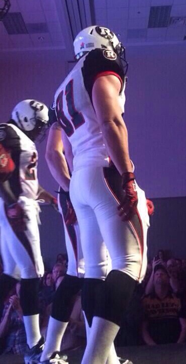
– Away uniform is depressing. It looks like a recoloring of Saskatchewan’s current road whites. Weren’t we trying to get as far away from what the GreenRiders were doing? I despise the white helmet. Stick with ONE black helmet for both uniforms. Establishing your brand in year one is VITAL. Look at the NFL teams; how many have multiple helmets?
In fairness, there are only so many jersey templates a team can use and those are likely determined by Reebok.
As for multiple helmets, I personally love it as a concept and love how the Redblacks white helmet looks.
I have heard the ‘stick with one helmet’ argument a couple times over the last few days, but don’t really get it. If a team can have 3 jerseys, no reason you can’t have multiple helmets. Baseball teams have different home/away/alternate hats, hockey teams often have different home/away helmets. Why not football?

Odd side note: last year, every West team in the CFL had an alternate helmet (SSK actually had 2). None of the East teams did.

Weird, eh?
– REDBLACKS plastered under the collar and above the front numbers. For OSEG, a business that has claimed to be supportive of both official languages since Day 1, this was a huge mistake. It now makes the English name of the team dominant over the French. I realize that they have “Rouge et Noir” on the front bumper of the helmet, but fans will not be buying the helmet. In order to offset this, they should have replaced it with “Ottawa.” The Renegades did this and it looked great.
Good point. Could have gone with OTTAWA on the front of both jerseys, or otherwise have REDBLACKS on one and ROUGE ET NOIR on the other. The bumper is a neat feature but also seems like a bit of an afterthought.
POSITIVES
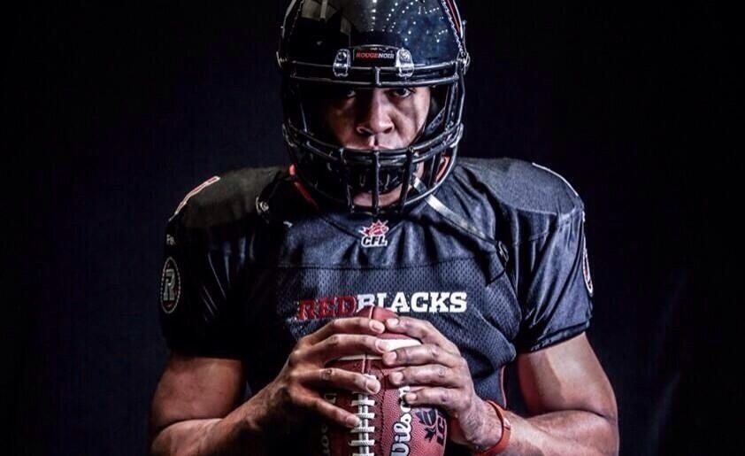
– Sawblade logo on both arms. Nailed it. I was hoping for this and bam. Likely the main reason why I will be buying a home jersey rather than settling on a t-shirt to wear to games.

– Black home jersey/black helmet. Traditional; enough said.
FINAL THOUGHTS
– I would have really liked it if the Redblacks took a page from Fury FC and presented options of uniforms for the fans to vote on. This would have made the fans feel included (unlike the choosing of the team name fiasco from last year) and important enough to have a say with where the franchise is headed.
In fairness to OSEG, the ‘Name Our Teams’ campaign wasn’t actually a contest.
I am on the fence with getting one of these but I will for the sake of supporting the team (the home not the terrible away jersey).
C’mon now!
We have a so-so name, a terrific logo and now a “meh” set of uniforms. 1.5/3 for overall branding at this stage from this season ticket holder’s opinion. I can only hope that we have a retro design come to pass and become our regular set.
Not sure if it will be retro, but it sounds like we will definitely have a red third jersey later this summer. In this Ottawa Sun piece writer Aedan Helmer and OSEG president Jeff Hunt tell us:
A red third jersey will be unveiled later in the summer, and while Hunt said they went for the classic look for the home and away duds, “that (third jersey) is going to be different.”
So, that answers the lack of red in the home & away set. But how ‘different’, exactly? We shall see…
Regardless, I’m stoked for kickoff and to have Ottawa return to the CFL regardless of what they are wearing. Go Ottawa!
Thanks Nevill!

I think this is the problem of the fan concepts. I’m all for fans getting involved, but people are always too attached to their concepts, so that no matter what the team does they’re doomed to fail.
That’s what happened with the name, where nearly everyone already had a favourite choice long before the team announced anything. So rather than judging REDBLACKS on its merit, people were disappointed their personal favourite didn’t get picked. It didn’t even matter if REDBLACKS was better or worse than their choice, at this point they had already invested so much in their name that anything else was going to be disappointing.
That’s why I think the team was smart not to go with fan vote as was suggested in the article. If you give fans 3 uniforms to vote on, two-thirds of fans will be disappointed when their vote isn’t the winner.
Personally I think the team nailed the uniforms. Could they be improved? Probably. But on their merits, these are a very nice set of jerseys.
Great points, Neil. I’m in agreement on the fan input. Damned if you do, damned if you don’t. I think you can pick your spots, but these organizations pay big bucks to develop logos & uniforms. I’m totally ok with them making the big choices themselves.
I am also very happy with the end result jerseys, although not what I was expecting.
Fun part – teams are refreshing uniforms every couple years nowadays, so eventually every fan is likely to find their favourite.
Thanks for reading!
I have to agree with Nevill on this, I am a bit disappointed, they could have done a lot better. They are not awful, but the home uniform is too black, it needs some red and white stripes so it is not so monotone. The away uniform also needs some red stripes and we don’t need the white helmet. The monotone look could be fixed by switching the home and away pants. I really liked Nevill’s design much more and wish they had chosen it. If the RBs want me to spend over $100 for a jersey they need to do better than this.
I definitely agree with Nevill that there is a distinct lack of red as well as an absence of francais in the uniforms. They could have easily reduced the font size and stacked rouge et noir / REDBLACKS on both jerseys and alternate the order (ie French first home, English first for away jerseys). At a minimum for red, they should have red socks for both home and away. They could have also kept the red numbers and letters for home and away, not just the home unis. I’m sure tweaks can be made, besides waiting for a third jersey. Regardless, July 18 can’t come soon enough.