By: Santino Filoso
Sig·na·ture (ˈsignəCHər,-ˌCHo͝or/)
noun
- a person’s name written in a distinctive way as a form of identification
The CFL in conjunction with Reebok recently released a brand new line of 3rd jerseys. This new “Signature Look” line has been mainly met with scorn and criticism even though they’re not all bad. In fact, we here at Defend the R took it upon ourselves to conduct a thorough analysis of each team’s new getups and rank them for you! Factors that went into our decision included visual appeal, style, fan interaction, use of team colours, how the uniforms looked in person vs being photoshopped/enhanced and ties to team history. Without further ado, here are the rankings:
9) The Saskatchewan GREENWHITES

Though we are a fan run, independent blog, we here at Defend the R were privileged to sit in on Saskatchewan’s meeting with Reebok’s creative team. Here’s the *actual* transcript of how it went down.
Reebok: Thanks for coming today everyone, before we begin I’d just like to-
Saskatchewan: Green
Reebok: Uh, yes, okay, as I was saying-
Saskatchewan: Green
Reebok: Okay, maybe I’ll just give you the floor
Saskatchewan: Green, green, green
Reebok: Hmmm, alright, we can work with that, how about 50 shades of green?
Saskatchewan: GREEN!
Reebok: Why don’t we break for lunch?
Saskatchewan: Did you say watermelon!?
Reebok: I’m sensing a theme here….
All kidding aside, these uniforms are a complete mess. If every shade of green was meant to be sewn together on a piece of fabric, Martha Stewart would’ve done it already. The helmets a look like watermelons which is an ode to the fans who wear them in the stands and the “Rider Nation” tag inside the collar is a nice touch. The GREENWHITES also deserve praise for breaking new ground as the first and only team in pro sports history to feature a tramp stamp on their jersey.

8) Winnipeg Blue Bombers

Traditional team colours, who needs’em? Not the Bombers faithful, at least to management’s thinking. Ditching their beloved golden threads, the Bombers instead embraced their inner warrior by sporting the US Military’s Arctic camouflage. There’s not a lot to like if you’re a Bomber fan, as even the helmet looks like the after splatter of a flock of seagulls. It’s as if Reebok mixed up their Toronto and Winnipeg files with this look being the bastard love child. Last time I checked the team without gold and wearing double blue was based in Toronto. Maybe these uniforms will prove to be a stroke of genius late in the season as the team will blend in and disappear into the snowy weather. When even your players struggle to appear enthusiastic, you know you’ve missed the mark.

7) The Toronto Argonauts
 should never go with this
What do you get when you cross Alvin the Chipmunk’s trademarked A with the Tennessee Titan’s road uniforms? The Argos’ new signature look of course! Don’t get me wrong, I love me some powdered blue but the layout is simply all wrong. The best part of this look is the helmet, which looks crisp and clean.

6) The Hamilton Tiger Cats

Raise your hand if you thought these garbage bag grey uniforms would be ready in time. The Ticat’s new look features charcoal grey to incorporate the smog from the factory smoke stacks surrounding Tim Horton’s field. The yellow reflector numbers are a nice touch as they will help fans keep track of their favourite players through the haze of still settling construction dust. Much like the Argos, the best part of these looks are the helmets with the faded tiger logo on one side and the player number on the other.

5) The Montreal Alouettes

The Als stuck to their traditional colours by going with grey and silver on their futuristic looking new uniforms. Going back to their roots, the Alouettes chose to honour the first French Canadian Bombing unit in the Air Force, the 425 Squadron, who were nicknamed the ’’Alouettes”. Renown for their toughness and bravery, the 425 Squad was the inspiration when Montreal chose it’s team name in 1946. The only real knock on this look that for whatever reason the team and league have released very few pictures, so it’s really hard to judge just how good the complete product is or what the helmets really look like. One thing that does stand out is that the feather sleeve design looks like snowflakes. The Als decided to only use MTL on the front because it’s a) unilingual so they avoid any problems with Quebec’s strict language police and b) it saves space.

4) The Edmonton Eskimos

The Eskimos stuck to the KISS (Keep It Stupid Simple) philosophy with their new look and I can appreciate that. The Eskimos kept to what they and their fans know, the green and gold colour scheme and in so doing created something that both traditionalists and younger fans can enjoy. While the enormous double Es might not be the prettiest thing to look at, keep in mind that these are supposed to be signature looks, so who can fault the Eskimos for putting their signature front and centre? Stitching the lyrics to part of their fight song inside the collar is a subtle touch that links these jerseys to the team’s storied history

3) The BC Lions

Jumping the gun on the rest of the league, BC actually released their signature jerseys last year, only they called them their “Premier Look”. The bane of sports announcers league wide, these sharp uniforms boast a gun metal look that is perfectly offset by the safety pylon orange outlining their black numbers. Though some complain the numbers are hard to read who cares, unless you’re playing the Redblacks, Ticats or Stampeders, you’ll be the only team on the field in all black! The Leos didn’t mess with a good thing by leaving the paw decal on the side of the helmet untouched.

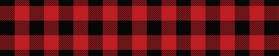
2) The Ottawa Redblacks

A wise man once said that once you go plaid you’re always glad and boy was he ever right. From Day One the Redblacks have embraced Ottawa’s lumber history and considering that our mascot is an axe wielding (though kid friendly) lumberjack, it was only a matter of time before plaid worked its way onto our uniforms. It’s called a Canadian tuxedo for a reason and we here in the Nation’s Capital choose to embrace stereotypes. The Redblacks signature look definitely puts the red in Redblacks. The checkered helmet is the crown jewel of this uniform (literally), though it’s a bit strange to see an Ottawa helmet without the white iconic R on it. But to be fair to Reebok, it probably didn’t mesh well with the plaid since everyone knows that the only thing that goes with plaid is more plaid. The one thing holding this look back from top spot is the big white looking (but actually silver) saw blade on the front, it just screams out of place. Not to mention the fact that it has an uncanny resemblance to a Dr. Seuss character.

1) The Calgary Stampeders

The Stamps must really love the Redblacks home uniforms, because their signature look is almost exactly the same. This NRA approved uniform sports a pair of revolvers on the shoulders and gloves; a tribute to the Wild West or a reflection of the city’s gang violence? What vaults this look ahead of all the rest is Calgary’s new helmet. The bitumen black front of the helmet fades away to red and is highlighted by speed lines and a chrome horse logo. Like the GREENWHITES , Ticats, and Esks, the Stamps also have an engraving stitched on their collar, but theirs is in Latin. It doesn’t matter that nobody on the team could tell you what “Quidquid Requiritur,” means (Whatever It Takes), having a dead language on your jersey simply makes you cool.

Will you buy your team’s new jersey? How would you rank’em? Be sure to leave a comment and let us know!

OMFG you really are the best Double R you made my days, couldn’t stop laughing. Great read love it.
my ratings:
Argos by far the best (even if it’s a bit Tennessee Titans), better than their regular ones.
‘Cats and Esks i quite like, both good variants while still looking like proper football uniforms.
Redblacks, still need to see those helmets live and in-person. Plaid is fun tho.
Riders and Bombers look like someone barfed into an oscillating fan.
Stampeders would rate in the top 4 for me if it wasn’t for those ultra douche-y helmets. Ugh.
Reebook gets barely a passing grade. where they stay traditional, they succeed, and where they trot out the CHROME! GOOFY PATTERNS! OREGON DUCK REHASH!, then the results speak for themselves. 😛
What a homer! If you cant write an objective article, why even write. I think we should see which jersey sells the most and let that tell the tale!!
As a REDBLACKS fan I have to say you’re showing a ridiculous and missplaced amount of bias by ranking Ottawa’s look 2nd. That uniform is horrible….. I don’t even mind the plaid that much but screwing with the logo and putting it smack dab in the middle of the jersey is a massive fail. Football jersey’s have numbers….. helmets have logos….. stop the madness. Also the shade of red is obnoxious and I hate it. A touch of plaid down the legs and sides of the jerseys would have been enough. Red helemets faded to black with our original logo like the stamps would have been badass. I think Ottawa dropped the ball bigtime on this one! (pun intended). Hamilton, BC, Calgary and Montreal are all waaaaaay better than Ottawa’s. Other than that, funny article though! /end rant.
Riders at the bottom is right. The detailing on the green parts of the uniform and helmet make it look like lizard scales from a distance. What do lizards have to do with Saskatchewan?
Most of the others range from ugly to meh. As an Eskimos fan, I’m not super excited about their “signature look”, but it could have been worse. I probably won’t be buying one though. The Lions have the best ones, IMO, but they’re still pretty meh.
BC was the First, they were awesome.. they are still the BEST… Why Calgary ripped off the Ottawa Jersey is very confusing.
I won’t rank them, just wish that I could read the numbers from the stands… I like to watch individual players…